Marketing is crucial in this day and age, and business success can rely on effective marketing. Marketing is of course a wide realm but I will just focus company branding – the logo, logotype, colours, slogans and name which gives the company recognisability. Every now and again companies will change their branding – this might be a subtle change that goes unnoticed by most people, or it could be a drastic change with colour changes, style changes and even a name change.
This leaves us to consider why it’s so important and why do companies feel the need to change branding which could be so recognisable? We looked at some notable brand changes in companies and whether they appeared successful, or just marketing faux-pas’. We also considered whether rebranding can affect your SEO and how to prevent a drop in the ranks.
Why change your branding?
Photo credit: rawpixel.com/Shutterstock
It’s unfashionable
Flared jeans and mullets were popular in the 1970’s but you don’t catch many people rocking them now. Our tastes change over time so what was fashionable at the time, may look unappealing and passé now. This is the same for brands. The trend nowadays is for brands to look sleek, sophisticated and minimalistic, with a simple colour palette and this can be observed in some well-known brands.
More on offer
Companies may rebrand as they expand, and have more to offer the consumer. An example of this is Starbucks Coffee, which in 2011 removed the ‘coffee’ bit from its logo. This is because it didn’t want to be seen as a café exclusively selling coffee, but a company that provides more than that; frappuccino’s, teas, cold beverages and food.
New CEO
If there is a reshuffle of staff, or a new CEO in the company, they may want to take a fresh approach with the branding to show that the brand has a new face and personality.

Reputation
If the brand has had an issue with reputation, then it may want to change the branding to prove that it is changing and instil trust of their products in consumers.
To be clearer
Some brands just don’t translate well – they are overcomplicated and not relatable by the consumer, sometimes keeping it simple is the answer with branding. When branding is simple it can also appeal to a wider audience rather than a niche.

Examples…
Lenovo
Lenovo rather dramatically changed their logo; the colour changed from blue to red and the typeface changed. Instead of being italicised it now stands straight and tall, giving it a more authoritative feel.
A border was placed around the logo, demonstrating the changing attitudes of the company. The box surrounding the logo means it can have any colour, pattern or design behind it – never “standing still”, always expanding with a forward-thinking attitude, matching their supporting tag line “innovation never stands still”.
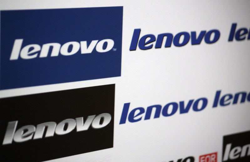
Photo credit: 360b/Shutterstock.com
The new look freshens up the branding and helps to reinforce they are a company always developing and expanding.
Is the new branding an improvement? – Yes!
![]()
Photo credit: lenovopartnernetwork.com/branding/Wikimedia Commons
UBER has grown massively, it now operates in 400 cities, 68 countries and delivers food and drink as well as transporting people. To match this growth, they decided they needed a brand makeover.
The logo has removes the curls in the letter so that it is easier to see from afar. It is simpler but does lose a bit of character.
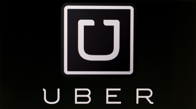
Photo credit: tanuha2001/Shutterstock
The colours which used to be plain black and white came across as distant and cold which didn’t match the company values. They made it more warm and ‘humanly’ with more colour and patterns. The brand colours differ depending on where they are viewed – they have edited them in line with different countries culture and history, for example, in Ireland the colours are greens and red, representing the greenery and Georgian red brick buildings.
However, it was the logotype which left customers baffled and came across as a bit over complicated and dare I say, pretentious. The logo simply does not translate into a taxi service and goes over the heads of most people.
It is supposed to represent ‘bits’ and ‘atoms’ – the atom represents the diversity of the company – responsible for many things, much like the atom.
The BIT represents technology – it’s complex, precise and advanced. The atom and the BIT are the building blocks that make up the company.
Is the new branding an improvement? – No!
Photo credit: x9626/Shutterstock
Instagram
![]()
Photo credit: tanuha2001/Shutterstock
The change of the Instagram logo caused a bit of a stir on social media. Users argued it looks a bit amateur and childish, and was an unnecessary modification from the old logo. The camera has remained but lost some detail and placed on a colourful rainbow gradient background. The logotype is attractive in a playful hand-written style.
Despite the furore over the logo it appears Instagram has nothing to worry about, seeing 200m daily repeat visitors so the new logo change is probably long forgotten.
Is the new branding an improvement? – No!
![]()
Photo credit: rvlsoft/Shutterstock
Airbnb:
The old Airbnb logo was Airbnb in a puffy, blue and barely legible writing. It looked a bit childish and outdated. The new design is much more attractive; a light pink bold and clear logotype with an attractive logo to boot.
The colour chosen is modern, playful and fun which fits the values of the company as a contemporary way to travel.
![]()
Photo credit: 360b/Shutterstock
The new logo – or the “belo” as it’s known, is simple and can be drawn anywhere. It signifies belonging, connecting and sharing. This logo has enabled Airbnb to have an offline presence, with an increase in physical media and the logo becoming more and more recognisable.
The website is also a lot cleaner and visually pleasing for users. With subtle animations and splashier images, giving it a more professional feel.
The new branding will only increase our awareness of Airbnb as a great alternative to holiday accommodation.
Is the new branding an improvement? – Yes
![]()
Photo credit: tanuha2001/Shutterstock
How to ensure your branding won’t affect your SEO
With the digital shift we are consuming more and more digital content, as a result, companies position in google is imperative in sending traffic their way and subsequently making the company more money.
Redesigning a website or carrying out CMS migration can cause your site to lose ranking and organic traffic. But fear not, you do not have to lose your hard earned position in the search engines when you change your branding. Following these hints will ensure you have nothing to worry about.

Photo credit: Naghiyev/Shutterstock
Changing your company name & URL
Changing your company name most likely means a change of domain, which can disastrous to your SEO if you aren’t careful. Before changing your name, you should assure the domain is available.
If your perfect domain isn’t available, try contacting the owner as it may still be possible to negotiate ownership.
Redirects
If you are just redesigning your website under a new domain name, you have to inform the search engines to redirect to your new site.
If you do create a new website, you do not want your old website going to the 404 Not Found screen. Ensure you redirect your old website to your new website.
Inbound links are crucial to a websites SEO. Figure out exactly who is linking to you, and where they are linking to. These links must be migrated. Using a website such as Majestic (https://majestic.com/) can help you discover where these links are coming from. Creating 301 redirects to all current URL links from old content to new content needs to be carried out, otherwise links from other websites won’t work, and will again result in the dreaded 404 Not found page.
If you fail to redirect, any content that shows up in Google searches will be lost.
You can insert code into your .ht access file that informs google to no longer crawl content on the old site. This is useful to avoid content duplication, and ensures that your new domain will show high up in the search engine.
Simple guide to redirects https://moz.com/learn/seo/redirection

Photo credit: commons.wikimedia.org
Linking social media accounts
Ensure you update your social media accounts with a new username and URL if necessary. Also ensure your new social media profiles are in line with your new branding.
If you change your URL, this will stop any old links from working. You therefore need to change the old links to redirect.
Be aware, certain social medias sites such as Facebook will only let you change this once, so make sure it’s exactly what you want.
Linking social media can help increase traffic to your website, and to create awareness of your company and brand. It is important to carry out a campaign showcasing your new brand on your social media profile to inform those who have liked your page. Social media can expand your audience so it’s a good idea to keep it up to date and relevant as any drive in traffic will enhance your ranking.

Photo credit: pixabay.com
Renaming images
Any new images on your website MUST be named appropriately, and ensure the term is relevant to the page’s content, and the image itself. Google links these images to your page, so it can ensure your page is found when people type in the key words.
Name your images with alt-tag words relevant to the image to ensure they can be found in Google.